Wednesday, July 15, 2009

A Personal Geography


This month, since I was moving from Brooklyn to Minneapolis, I decided to use Google Maps to chart all the different places I've lived and the routes in between them, although I guess everything has a common point of origin being my hometown of Wooster, Ohio. Someday, I should make this trip as a circle.

Monday, June 15, 2009

Ray Johnson's House


I knew Ray Johnson was widely considered to be a great artist for his postcards and collages in the 60's, but until I saw How To Draw A Bunny I didn't know the mysterious and tragic circumstances of his death in 1995.

I had a job that took me out to Locust Valley once a week and I was able to figure out where Johnson's house was, as described in the film. It was only a short walk from where I was working, so one day I took a few photos of the house and the nearest post office as a sort of secret pilgrimage and tribute. I like imagining the reclusive pop artist routinely sending and receiving all this crazy stuff though this suburban small town post office and stockpiling this extraordinary archive inside his quiet little house on his quiet little street.


Sunday, May 17, 2009

Mayflowers


This month's postcard is printed on leftover seed paper I found at work. The paper comes from Botanical Paper Works and you can find directions on how to use it here.

Friday, May 8, 2009

Clearing


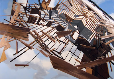
Tonight I was fortunate enough to attend the opening for Ben Grasso's show at Thierry Goldberg Projects. There's not much I can say about Ben's fantastic paintings, although I can say I was thrilled to see so many former classmates there. Where have I been hanging out that I never see these people?

Wednesday, April 15, 2009

Saturday, January 17, 2009

Wednesday, January 14, 2009

This Week in Bad Design: CIA Expansion


I recently was made aware of a petition being distributed among students and alumni of the Cleveland Institute of Art regarding a large building proposal to expand one of the two buildings that currently make up its campus.

If you know me, then I don't need to tell you how much I love the city of Cleveland and value my education at CIA, but the more I learned about this building proposal, the more misguided is seemed. 

This is what I've pieced together in the past week: CIA unveiled an ambitious plan in October 2007  designed by Dutch architects MVRDV. Fast forward to November 2008, and its appears that the Dutch design had gotten too  expensive while the school made little progress in the fundraising department. So they re-present a new design with a new big concept: Banners!

The banners don't really seem to function as signage or an interactive public art space but as a cheap device to cover up the design underneath. But what is going on underneath there? The banners are not so bad in and of themselves, its the absence of anything beyond that.

We want to see ideas that will make CIA more environmentally progressive and community-oriented. We want the the inside of the school to be all about cutting-edge facilities and spaces that reflect the values of the institute. Obviously, I don't know a great deal about architecture and construction projects like this, but I do know that good design starts from the inside out, not the other way around. Thats something I learned at CIA. Now CIA needs to rethink that lesson for themselves.